From: Knight Sports Now
Date of Publication: Jan. 5, 2020
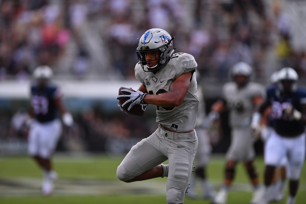
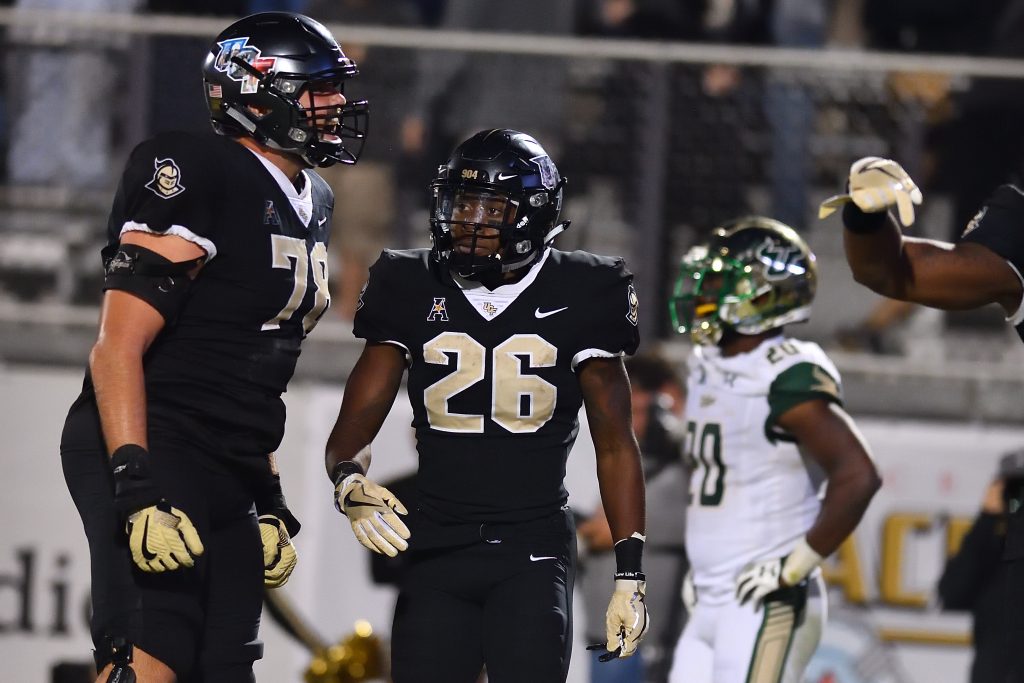
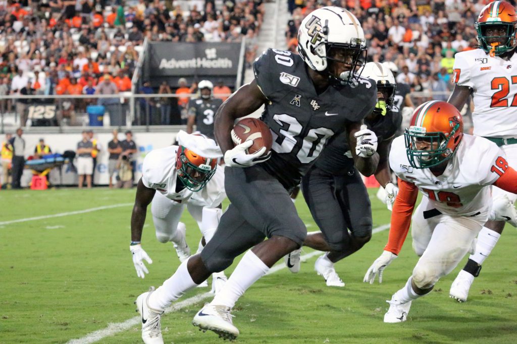
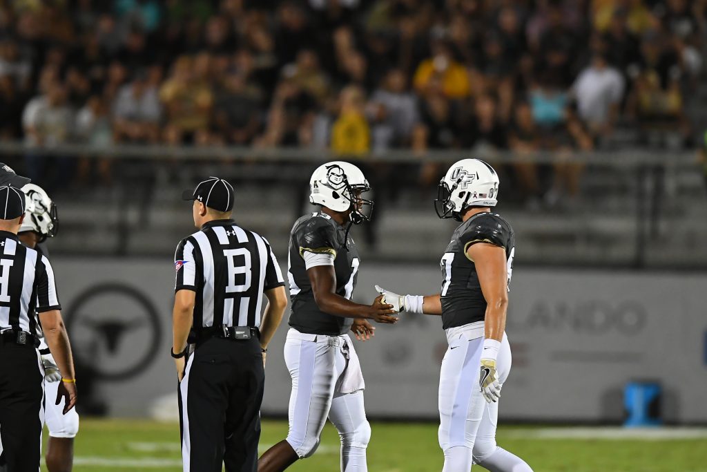
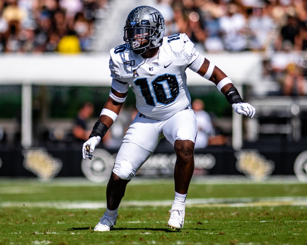
The days of UCF donning pale yellow jerseys and plain white helmets are long over. The Knights have had an explosion of creativity since redesigning their uniforms before the 2016 season.
After wearing just three helmet designs and a basic set of uniforms from 2007 to 2015, UCF has worn 44 unique uniform combos in the 52 games since redesigning. From player photo decals to moon helmets, the team has sported plenty of amazing uniforms.
And I ranked them all.
Check out the definitive rankings of all 44 UCF uniform combos below.
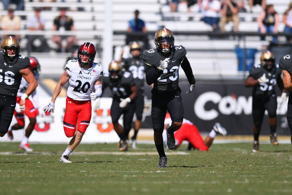
44. Gold/Anthracite/Black with patriotic decals
Game Worn: Cincinnati, 2016
Of the 44 looks UCF has worn in the last few years, very few have actually been bad. But this. This is bad. The team gets a little bit of slack for trying this since it was only a few games into the redesign — which means there was still some experimentation going on with what looks good. Mixing a dark gray and a black with a brightly colored helmet featuring even more brightly colored decals was not the best idea. UCF has not mixed black and anthracite since, so clearly the lesson was learned.
43. Pewter/White/Black with home state decals
Game Worn: USF, 2018
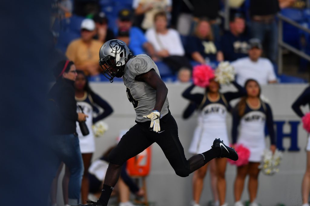
This was the first and only time that we got to see the pewter helmets in 2018. Unfortunately, our one glimpse at UCF in silver was ruined by a weird combo and some decals that just did not work. Each helmet featured an outline of the player’s home state around the main logo. Which would be fine except that logo for some reason was incredibly tiny. Add in a chrome gold stripe and a combo featuring three colors and it’s easy to see why this look finished so low. (Did I subconsciously move this to the bottom of the list because it was also what the Knights were wearing when McKenzie Milton got hurt? Yep.)
42. Gold/Anthracite/White with white decals
Game Worn: Stanford, 2019
I really have to believe that wearing a combo this bad for a game this big was not the initial plan. UCF got its fans excited ahead of its most high-profile Power Five home opponent in years by unveiling a gold helmet with white decals. It looked gorgeous and would certainly look even more gorgeous with the team’s white alternate jerseys (we’ll get to that later). But instead the team wore anthracite jerseys with white pants, such a mismatched combo with so many clashing colors that I almost wanted ESPN to randomly decide to not televise the game. But there’s a catch. In the past, UCF has tried to wear all white at home and been rebuffed at the last minute by opposing teams who have to give approval. We know for a fact it happened with FIU in 2017. It was rumored to have happened against Pitt in 2018. Did Stanford pull the plug on what would have been an awesome combo? We can’t know for sure, but I can’t say Stanford didn’t deserve to be blown out if it’s true.
41. Pewter/Pewter/Pewter with normal decals
Game Worn: Houston, 2016
This is, once again, forgivable since it was back in the days when UCF was still just testing out new combos. When the Knights had just unveiled a new color, we all naturally wanted to see them in that color. And look, I love pewter. If it were up to me, the team would be incorporating that color way more on a game-by-game basis. But nothing except pewter? Yikes.
40. Black/Black Alternate/Gold with digicamo decals
Game Worn: SMU, 2018
Here’s the last UCF combo that I genuinely straight up did not like. That’s right, Knight Nation. Thirty-nine of the 44 combos from these last few years are objectively “good.” We’re truly blessed. But that doesn’t change that this look is not. I wasn’t as opposed to the return of gold pants as some fans, but pairing them with the team’s weakest jersey and some helmet decals that just don’t match the team’s brand made for a very uninspiring combo. I don’t think it’s a coincidence that we have not seen the gold pants or the black alternate jersey since.
39. Black/White/Black with normal decals
Game Worn: Michigan, 2016
There isn’t anything wrong with this combo. It’s fine. But it really is just fine. There are more than a few teams across the nation that can sport this look and the decals are just meh. But I’ve got to say, the team brought in some chrome gold decals to improve this look and the results were great. That version of the combo is much, much higher on this list.
38. Gold/White/Anthracite with normal decals
Games Worn: Cincinnati, 2017 and East Carolina, 2018
Some fans disagree with me on this, but I am not a fan of the tri-color combos. It just feels like there’s too many things going on at the same time, and throwing gold, white and dark gray into the same combo is over-complicating things. I was worried it was becoming an annual look after making appearances in 2017 and 2018, but we luckily didn’t see it this season.
37. White/White/Anthracite with normal decals
Game Worn: East Carolina, 2016
This is another one of a group of combos that was vastly improved when the team switched to chrome gold decals instead of the normal jumbo-sized UCF logo we saw for most of 2016. This is a serviceable away look, and it was nice at the time. But it’s been buried by so many other cool designs and combos over the last few years.
36. Pewter/Pewter/Pewter with patriotic decals
Game Worn: UConn, 2017
I haven’t been a big fan of any of the patriotic looks UCF has sported, but the all-pewter just kind of works here. Combined with the red, white and blue decals, it gives off this military vibe that was fitting and made for a solid look. If anything knocks it all the way down here, it’s probably that it doesn’t feel like a UCF uniform. I’m always going to want at least some hints of black and gold (unless we’re talking about the space uniforms, which we’ll get to later.)
35. Gold/Pewter/Pewter with rivalry decals
Game Worn: USF, 2016
For the record, I like the combo by itself and wouldn’t at all mind seeing it again. It’s literally a silver-and-gold uniform; who wouldn’t like that? And it even has a variation of the “State of Florida” UCF decals, which I’ve always loved seeing. But the rivalry-specific decals weigh it down. The sword stripe features the War-On-I4 catchphrase as well as a map from Orlando to Tampa. Cool concept, right? The only problem is that it was way, way too small to be noticeable unless you were holding the helmet up to your face. This was also back when USF was briefly the dominant team of this rivalry, and it rubbed me the wrong way that the Knights were literally changing their uniforms to represent the rivalry and the Bulls had not responded in kind. It made UCF seem like the one vying for attention, which is never a glamorous spot to be in.
34. Gold/White/Black with normal decals
Games Worn: UConn, 2016 and SMU, 2017
I pretty much have the same reason for this combo being where it is as I did for the slightly different gold/white/anthracite. The black pants honestly do make a pretty significant difference though, creating more contrast and looking a little more “UCF.”
33. White/White/White with normal decals
Game Worn: SC State, 2016
And here is the first ever combo we saw with the new uniform set, as the Knights rang in the Scott Frost era with a whiteout on a field with white logos. It’s hard to screw up a whiteout and, while I ranked this the lowest of UCF’s different all-white looks, it was still a breath of fresh air to see after years of pale yellow jerseys and basic helmets.
32. White/White/Anthracite with chrome gold decals
Game Worn: Temple, 2017
The chrome gold makes a huge difference. UCF switching that to become its primary decals was one of the best decisions this school has ever made, up there with hiring Danny White and claiming a national championship. Even a combo like this, which was just OK with normal decals, pops so much more with that glint of gold on the helmets.

31. White/Black/Black with patriotic decals
Game Worn: UConn, 2019
As I’ve said higher up, I’m not a fan of the patriotic looks. It got to the point this past season where I was dreading a little bit each week if we were going to have to see some weird-looking combo because it was the military appreciation game. But this was a look I could finally get on board with. Going all black for the jersey and pants kept it looking like a Knights uniform and the patriotic UCF logo has never looked better than with a white background. Not to mention a patriotic Knightro decal on the other side of the helmet that was cool to see.
30. White/Anthracite/White with chrome gold decals
Games Worn: Austin Peay, 2017, Pitt, 2018 and LSU, 2018
I’m going to quickly say that I like this combo so I can go on a rant. Love the helmet. Dark jersey with white pants and lids always looks nice. OK, there you go. I like it.
Rant time.
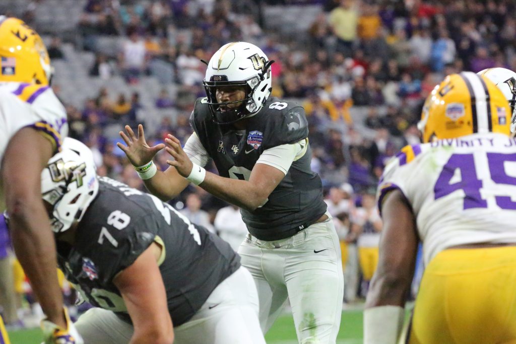
Why in the world did UCF wear this for the Fiesta Bowl? Going into the game, it was arguably the most important matchup the Knights had ever had. They were riding a 25-game winning streak and had a chance to be the first team in decades to notch back-to-back undefeated seasons. And, much to my excitement, they were the higher seed and would get to wear whatever uniform they wanted. And they pick … this?? UCF is back on the world stage with everyone watching, and they decide to go with some gray jerseys and white helmets? Could it have been more off-brand? I will never understand why they couldn’t have just thrown on the black jerseys or worn gold helmets like they had in the Peach Bowl. I can’t prove this is part of the reason that UCF lost, but you can’t not prove it. OK, rant over. I feel a lot better.
29. White/Black/Black with chrome gold decals
Game Worn: Memphis, 2018 (CCG)
A really simple, straightforward look, to the point that I’m surprised it took us almost three years to see it. I’m never going to say no to matching the black pants and jerseys together and the white helmet pops nicely to finish it off. This is obviously a variation of the patriotic look that came in at No. 31, but the chrome gold decals bump this one up a few spots.
28. Pewter/Black/Pewter with normal decals
Game Worn: FIU, 2016
Mixing black and pewter together has made for some nice combos over the last few years. Those colors work well together, and I’ve always been impressed with how seamlessly gray fits into UCF’s color scheme. As is the case with a lot of 2016 combos, this one gets dragged down by the decals, which are fine but unspectacular compared with the ones we saw in later years.
27. White/White/Black with chrome gold decals
Game Worn: Pitt, 2019
I’m honestly surprised that it took more than three years for UCF to try out this combo. Obviously this being worn as the Knights’ historic regular season winning streak came to an end is going to negatively influence some perceptions of it, but it’s definitely worthy of becoming an annual road combo.
26. Black/Black Alternate/Black with player decals
Game Worn: USF, 2017
I am never going to be a fan of the black alternate jerseys over the regular ones. You can’t tell me that the black Pegasus jersey would not have improved this combo. But either way, it’s hard to screw up a blackout with UCF’s uniform set and this gets the job done. Plus, it features some amazing decals, with each one featuring a photo of the player wearing the helmet within the UCF logo. I don’t know how you even conceptualize that, let alone pull it off.
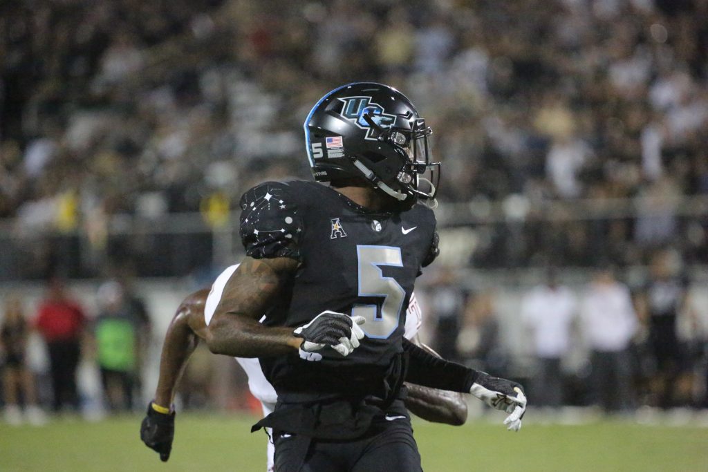
25. Black/Black/Black with gold Knightro decals
Game Worn: Tulane, 2016
This was the first blackout that we got to see after the team redesigned, and it was a good one. This was also back in the day when UCF dropping surprise decals before a game was unusual and a big deal, making the Knightro decals even more cool. (In 2016, UCF wore nine helmet designs after wearing just three from 2007 to 2015. I mean, come on.)
24. Black/Black/White with space decals
Game Worn: East Carolina, 2017
And here is the first of the space looks that UCF has been sporting annually since 2017. There really are few uniform concepts in college football that can match the creativity of capturing a school’s ties to the space program on its helmet. The moon decals, the constellation stripe and little white stars dotting the black helmet made for an amazing look. But the overall uniform is dragged down by a just OK combo. This should’ve been a blackout, and the white pants look out of place. And as amazing as the helmets are, they didn’t exactly match with the gold trim of the jerseys. Luckily, that wasn’t a problem for UCF going forward as the team moved beyond just decals when it came to the Space Game.
23. Black/Anthracite/Anthracite with throwback decals
Game Worn: Navy, 2018
I have always loved the “State of Florida” decals that UCF originally sported back in the 1980s and 90s. We saw a modernized version in 2016 but seeing the original look last season was really, really awesome. This combo could’ve been a lot higher if it was a blackout instead of all anthracite (an anthraciteout?) but there wasn’t much to be done about that with it being a day game.
22. White/Anthracite/Anthracite with chrome gold decals
Games Worn: FIU, 2017 and FAMU, 2019
I almost always prefer black over anthracite, but this combo looks better with dark gray than black and I can’t explain why. It just does. I was a little surprised the team took a year off from this combo in 2018, but I’m willing to bet fans will be seeing it again down the road.
21. White/White/White with chrome decals
Game Worn: Memphis, 2018
It’s amazing what a difference decals can make for an overall look, with this combo coming in 12 spots higher than the same uniforms but with normal decals. Chrome looks so nice. This was also a slightly altered take on one of my favorite UCF helmets, which featured the chrome UCF on one side and a chrome Knightro on the other. (The decals didn’t show up super well in the game because it was an overcast rainy day in Memphis, but we don’t knock combos for weather-related reasons here at Knight Sports Now.)
20. Black/White/Black with chrome gold decals
Game Worn: Temple, 2019
Another example of chrome decals elevating a combo. They look so good and match with UCF’s uniform set so well. This was a much improved take on the same combo that we saw against Michigan three years earlier.
19. Black/Pewter/Black with chrome decals
Game Worn: Memphis, 2017 (CCG)
If you follow me on Twitter (or have read any of this article), you’ve probably seen me say this often: UCF needs to use pewter more. It’s such a good complementary color to the Knights’ scheme and that was on full display in this game when the pewter jerseys were book-ended with black pants and lids. It was a nice look for a big game.
18. Pewter/Pewter/Black with black Knightro decal
Game Worn: Navy, 2017
This might be the most underrated road combo that UCF has worn since the redesign. I said just above how well pewter and black mix together, and this look really showcased it. Add in the black Knightro decal on one side of the helmet, and we’ve got a fantastic combo on our hands. No one mentions this one when talking UCF uniforms, but I’d love to see it on the field again down the road.
17. Black/Pewter/Black with chrome gold decals
Game Worn: Marshall, 2019
Essentially the same combo that we saw against Memphis in 2017, but this version gets a slight bump for using chrome gold decals instead of regular chrome. It matched better with the gold accents on the jersey and also featured a subtle Florida flag and Lake Eola fountain within the UCF logo, which was an awesome touch.
16. White/Black/White with chrome Knightro decals
Game Worn: Tulsa, 2016
It’s a genuine crime that we have not seen this helmet since 2016. It’s the first ever surprise decal that we got from UCF (revealed during homecoming week and worn again with this combo in the home finale) and it’s up there with any other helmet the team has worn, even the space ones. The combo itself is very nice as well. It’s hard to make black, white and chrome look bad together.
15. Pewter/White/Pewter with chrome gold decals
Game Worn: FAU, 2019
As much as I love pewter, I was totally fine not seeing it mixed with white. The only glimpse we had gotten of this was a spring game where UCF wore white/pewter/pewter and it was … bad. I didn’t think there was enough of a difference between white and light gray to make it work. But I was so, so wrong. This was my personal favorite road look for the Knights this year. It looked so sleek, and the gold in the decals did enough to keep it feeling like a UCF uniform.
14. Gold/Anthracite/Anthracite with normal decals
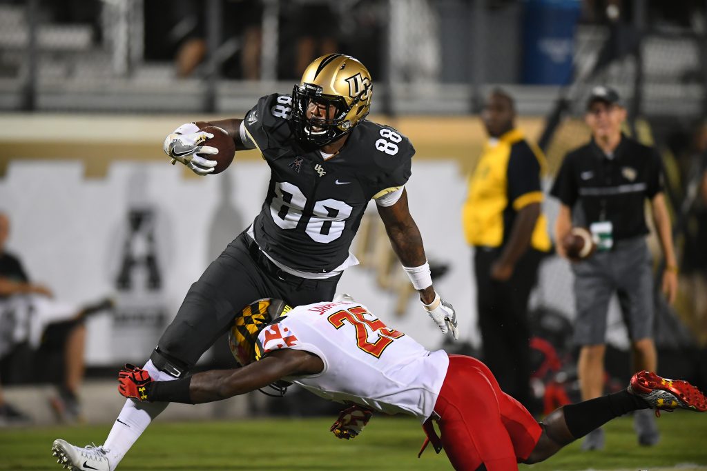
Game Worn: Maryland, 2016
At the time this combo was worn, it was the first game where UCF had worn gold helmets in 10 years. That was way too long of a stretch and it’s been great to see the gold lids worn regularly since then. It matches the team’s brand very well.
13. Black/White Alternate/Black with white decals
Game Worn: UConn, 2018
OK, as much as I don’t care for the black alternate uniforms, the white version is excellent. The gold numbers and Knightro on the sleeves fit a lot more with a white background. The black collar also matched incredibly well with the black helmets and pants. Add in a white UCF logo with hints of gold to match the jersey, and you’ve got an amazing combo.
12. Gold/White Alternate/Black with white decals
Game Worn: Cincinnati, 2019
All the stuff I just said above? Pretty much counts for this look, too. As I said earlier, I don’t care much for tri-color combos but this one gets a pass because it’s absolutely terrific. The gold and white helmet mirrors the white and gold jersey. The black pants match the black collar and sleeves. What a look. Unfortunately, UCF fans have to remember this combo with sadness since it was worn as the Knights fell to the Bearcats, effectively ending their conference championship and New Year’s Six hopes. But a great uniform is a great uniform. Let’s see the team redeem it with a win next season.
11. White/Black Alternate/White with chrome gold decals
Game Worn: SC State, 2018
Yep, I’ve gone on and on about how I don’t like the black alternates, and then a combo featuring it just misses the Top 10. Listen: I am FINE with this jersey. But only when it’s worn with white helmets and pants. Just like how lots of black makes the white alternate look better, lots of white helps this one a lot. This is a clean look and I honestly would not mind seeing it again, even if I couldn’t help but celebrate that we got through 2019 without seeing the black alternates.

10. Pewter/Black/Pewter with chrome gold decals
Games Worn: Memphis, 2017 and East Carolina, 2019
We kick off the Top 10 with some pewter, and just in case you missed it the first 80 times I said it, that’s because I love pewter. Some fans have complained this combo looks like the Oakland Raiders, but there’s enough gold (and UCF and Pegasus logos) to make this a clear UCF look. It’s an awesome combo and obviously got a huge jump over the normal decal version way back down this list. I can’t stress enough how positively the chrome gold affected the Knights’ uniforms.
9. White/Anthracite/White with chrome Knightro decals
Game Worn: Temple, 2016
You can head back over to No. 16 for my thoughts on these awesome helmets. Switching the black jerseys for anthracite makes a big difference here though. White flows into gray better than it does into black, and this was a much more complete look when it featured a lighter jersey to match the helmets and pants.
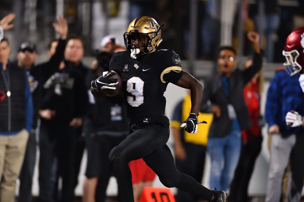
8. Black/Black/Black with chrome gold decals
Games Worn: Arkansas State, 2016 and USF, 2019
For a lot of fans, this is still the default uniform that comes to mind when they think of UCF. My ideal Knights uniform has a little more gold, but this remains a fantastic look for the team. Arguably the best thing about the team’s set of uniforms is that they make for awesome blackouts. Throw in the lovely chrome gold decals and it’s easy to see why this combo is so loved.
7. Black/White Alternate/White with chrome gold decals
Game Worn: Tulsa, 2019
I’m seriously all for pairing the black helmet with the white alternates in as many combos as UCF Equipment can come up with. It always looks good. The mark of a good combo is when UCF can be in the middle of losing a game against a team that they absolutely should not be losing to under any circumstances, and I can still think, “Well, they look nice at least.” This combo, unfortunately, passes that test.
6. White/White/White with chrome gold decals
Games Worn: Maryland, 2017 and Tulane, 2019
Just missing out on the Top 5 is the best whiteout look that UCF has ever sported. It’s perfect. All-white but with oversized black numbers with gold trim, bright flashes of gold on the helmet and the always-wonderful Pegasus shining on the sleeves. It’s a truly terrific combo, and I honestly don’t know what the team could do to improve this look from what it already is.
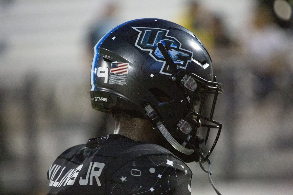
5. Moon/White Space/White Space
Game Worn: Houston, 2019
It would’ve been impossible to leave either of the full space uniforms out of the Top 5. How do you even come up with this? A full moon helmet, featuring the light side and dark side, with craters and all. Add in these spectacular white jerseys with constellation numbers and Canaveral Blue trim, and it’s pretty close to perfect. The only knock on this combo is the red and black “USA” on the pants, meant to evoke the old Apollo rockets. It felt a little out of place from the blue-white-gray of the rest of the uniform, but was still a nice historical touch. Also of note: this is the first time in UCF’s 40-year history that the team did not wear black facemasks, with these being light gray and dark gray to match the helmets.
4. Gold/White/White with normal decals
Game Worn: Auburn, 2017
I promise that this wasn’t placed this high for nostalgia reasons, even though it’s what UCF wore to cap off an undefeated season with a Peach Bowl win over Auburn. This takes the title of best UCF road combo because it’s so simple and yet so perfect. I’ve always been a fan of color helmets to offset all-white uniforms, and white and gold pair so well. For as many crazy designs as UCF has worn, this is still one of the few that is synonymous with the team. Show even a casual college football fan a picture of this uniform and there’s no doubt about who they’re looking at.
3. Black/Black/Black with white decals
Game Worn: FAU, 2018
The Knights’ best-ever blackout comes in at No. 3. The UCF logo looks so good in white, and that version has been featured much more across athletics over the last couple years. The black-and-white uniform look came together so well, with the white logo matching the white numbers but still having some gold features in the accents on those numbers and sleeves. It’s a terrific look that definitely deserves to be seen again.
2. Black/Black Space/Black Space with space decals
Game Worn: Temple, 2018
There are more than a few UCF fans who I’m sure would have liked to see this combo come in at No. 1. And honestly, I can’t blame them at all. None of us really knew what to expect for Space Game 2.0. We knew the team would be going beyond just decals, but what exactly does a space uniform look like? UCF Equipment could not have done a better job. Going all black was an obvious choice, but ditching the traditional black and gold color scheme while adding a new color in Canaveral Blue was genius. Every aspect of the uniform came out perfectly. The reflective numbers, the constellation sleeves, the space font for player names, and of course, the Citronaut finally making a football appearance after all these years. It was an epic look that took social media by storm. The fact that it comes in at No. 2 says a lot about what an impressive lineup of uniforms the team has sported over the last few years. It lost out to a combo that may not be as outwardly spectacular, but is undeniably UCF.
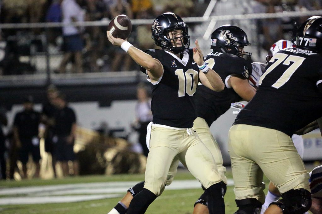
1. Gold/Black/Black with normal decals
Game Worn: Cincinnati, 2018
This uniform is UCF’s brand and identity more than any other combo that we’ve seen. When the team came out for its College GameDay showcase in an all-black look with those gold helmets, it didn’t feel like a new combo. It felt like this was what the Knights were always meant to look like. It felt like they had worn this combo 1,000 times before and that was all they would wear going forward. It may not have been as flashy as the space uniforms, or as sleek as the blackouts, but Gold/Black/Black is and always will be the true look of a UCF Knight. And that’s why this beat out everything from player photographs in decals to moon crater helmets to become the best uniform in UCF history.