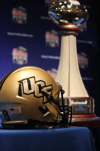
From: KnightSportsNow.com Date of Publication: June 3, 2018
Here are the definitive rankings of every helmet UCF Football has ever worn, from worst to first.
26. Black with no decal: 1983-1984
Let’s be real: this is a black helmet. What could possibly be interesting about a black helmet. Yes, this was a bit before decals and sports design really took off, but there’s really no excuse to be this boring. Even for a Division II team.
25. Gold with no decal: 1979-1980
I mean, at least this helmet was a color not all schools have? I’m really just never going to get on board with decal-free helmets. The only reason this helmet doesn’t rank dead last is that it’s what the Knights wore in their first ever game. I’ve got to award some nostalgia points for that.
24. Gold with Pegasus decal: 1981-1982
Let me be absolutely clear: I am 100 percent behind UCF putting the Pegasus logo on its helmets. I’m honestly surprised it hasn’t happened in the past couple years since the team redesigned and began experimenting with crazy decals. Fingers crossed we’ll get to see the Pegasus on a helmet soon.
But this version of the Pegasus could have been executed much better. A black decal on a gold helmet doesn’t look great, and the white “UCF” script below it comes across as pointless and starts to really clutter up the side of the helmet. Here’s hoping the school takes another shot at this soon and gets it right.
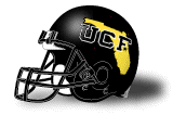
23. Black and gold: 2013
I mean, what is this? What was the point of making this? Why is there a random gold pattern on the top? Why is there a white outline around the UCF logo? Why do the golds in the logo and on top of the helmet not match? I want answers!
This helmet luckily had a short history, only being worn once against USF in 2013. It was especially memorable of course, since the helmet was used as part of a “blackout” campaign for that game. And then the Knights charged out of the tunnel in those helmets, black pants… and gold jerseys.
Younger UCF fans: you should feel incredibly lucky every time your team unveils cool new uniforms. You have no idea what it was like in the O’Leary days.
22. Gold patriotic: 2016
I’m all for patriotism, and it’s been cool to see the Knights experiment with American Flag decals over the last few years. But something about putting them on a gold helmet just didn’t work. That’s a lot of primary colors that are clashing together and the look as a whole just isn’t that great.
What’s even more frustrating is that these helmets could have been a lot better. The person who designed them posted some earlier concepts online that feature a black helmet with gold patriotic logos. The look wasn’t perfect, with the UCF logo being a bit hard to identify, but with some tweaking it could have been one of the best patriotic looks in the nation.
21. Gold with UCF Knights decal: 1996-2002
These were really the first modern helmets for UCF, as it switched to them the same time the team moved to FBS and kept them into the 2000’s. But they really just aren’t anything special. No stripe down the middle, a gold that doesn’t really match the team’s identity, and a basic black logo doesn’t exactly make for an exciting helmet.
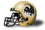
20. Gold with UCF decal: 2003-2006
This is essentially the same helmet the team wore from 1996-2002, except the “Knights” was removed from below the logo. This was a good move, since including both the school name and mascot name on a helmet can be a bit redundant. So, it gets a slight edge on the other version of this design.
19. Gold with Florida decal: 1995
I’ve always loved UCF’s helmets that feature the state on the side. For a young school that plays in a state with three powerhouse programs, it’s a great way to claim an identity and show that the title of “best program in Florida” is always up for grabs.
(Of course, FAU totally ripped of this design for their new helmets. If the Owls try to wear those decals when they come to Orlando this year, I’m inciting a riot.)
But, this is probably the weakest version of those helmets. I’ve never been a fan of black decals on a gold helmet and it just doesn’t look as good as some other versions the team has worn.
18. Gold with Florida decal: 2016
For reasons stated above, it was really, really cool to see the Knights bring the state of Florida decals back in 2016. The updated look is modernized but still works, and using gold decals on a gold helmet was a great move.
The only thing that drags this helmet down is the stripe. These helmets were worn against USF, so it features a map of Florida as well as the “War on I-4” phrase. This was problematic because it meant these helmets couldn’t be used in another game (unless the Knights just really wanted to promote their rivalry, I guess) and it was also a lot of design to fit into a really skinny stripe. Personally, I like for designs to be visible without having to hold the helmet up to your eye.
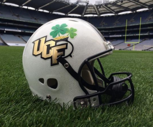
17. Ireland helmet: 2014
In hindsight, the fact that George O’Leary allowed the team to wear special decals for a game is astounding. I mean this is a guy who once implied Oregon’s uniforms looked like Halloween costumes. But somehow, this design got through.
The tweaks are simple: adding a pot of gold and a clover leaf, as well as a new shiny texture for the logo. The new decal toed the line of being creative while sticking with the team’s base identity and made for a very nice change of pace.
The only issue here is that the base helmet design isn’t all that interesting, and even these decals couldn’t raise it too high on this list.
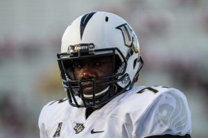
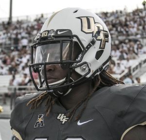
16. White with traditional stripe: 2007-2015
Speaking of that helmet, here it is. Even after two years of outstanding creativity, this is still the helmet most fans associate with UCF. I understand why the team chose this design at the time. The Knights were coming off years of toying around with different black and gold helmets, but had never really sported a classic college football look. Or even a white helmet.
With the move to an on-campus stadium imminent, and the athletics program switching to a new, more classic-looking logo, it made sense for the team to simplify its design.
But the problem is that UCF didn’t even think about alternate helmets for years, and after nearly a decade of this helmet, fans were more than ready for something else.
15. Pewter Patriotic: 2017
Even though it mostly used the same decals, this was a huge upgrade from the team’s attempt at an American Flag helmet the year before. Using the pewter helmet allowed the red, white and blue logo to pop much more, since it didn’t have to clash with bright gold.
The gunmetal grey color of the helmet also gave off a subtle military vibe, working even better with the patriotic theme.
14. Black with Florida decal: 1985-1994
This still remains the best version of the Florida decal we’ve seen. The black helmet with the gold state, along with block UCF letters and a little star where Orlando would be, makes this an excellent helmet. I would love to see a modernized version in these colors, maybe even with chrome gold.
13. Black with sword stripe: 2016
This is the first of the four new base helmets that UCF unveiled back in 2016. Across the board, the designs were great, but the black helmet was the weakest one. Something about using a black sword stripe on a black background just never seemed to work, even if the design as a whole was better than pretty much anything the Knights had worn in the past.
12. White with sword stripe: 2016
You can never go wrong with matte white. You really just can’t. UCF’s logo has always looked good with a white background, and blowing up the logo as well as replacing the traditional stripe with one mimicking a sword were both solid moves.
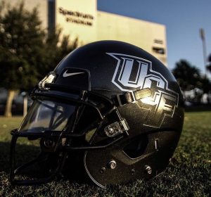
11. Pewter with sword stripe: 2016
When this helmet was first unveiled, I didn’t really know how I was going to feel about it. A silver helmet? How does that relate to the team’s brand? But it turns out the pewter helmets have fit flawlessly into the Knights’ uniform set. They’ve worn several nice pewter designs, this one just happens to be the weakest.
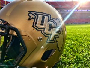
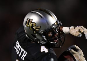
10. Gold with sword stripe: 2016-present
It really is sad that UCF fans had to go a decade without seeing their team wearing gold lids, but they were rewarded with the best gold helmets that the team has ever worn, when these were unveiled in 2016. Using a gold UCF decal on top of a gold background ended up looking great, and this is by far the best shade we’ve seen in the team’s history.
9. Pewter with chrome gold decal: 2017
UCF has done a lot with chrome gold in the past year, and has pretty much phased out all non-reflective decals at this point. But this is the weakest of those designs. Pewter is always going to look good, but it just didn’t mesh quite as well with the shiny gold than some of the other helmets.
But that doesn’t change how nice of a design it is. It’s unquestionably one of the best looks the team has ever had.
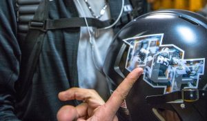
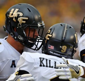
8. Black with player decals: 2017
Where do I even begin? I’m sure there are plenty of people who would argue that this should be No. 1 on the list and, in all honesty, they have a pretty good case. I don’t know if there has ever been such a daring design in college football history as using photographic decals to put each individual player on their helmet.
This design is crazy. Actually crazy. But somehow it works, and got tons of national buzz since it was worn in arguably the best college football game of the year.
What holds it back from being higher on this list are a couple of small things. First off, the logo has a white outline. I hate white outlines and, even if it was necessary given the nature of the decal, I’m not letting it slide.
Second, using a black helmet had some drawbacks. The sword stripe is mainly unnecessary since it’s not even noticeable and the decals, which were obviously very colorful, feel sort of out of place with all the darkness around it. You could argue this was to create contrast, but something about it just felt a bit off to me.
Either way, these are still some of the most creative and genuinely fascinating helmets you’ll ever see on a football field.
7. Black with Knightro: 2016
Who knew using the Knightro logo on a helmet would look so damn cool? That was especially true for this helmet, featuring a gold Knightro on a black background. They looked great on the field and I’m a little bummed the team hasn’t ever gone back to this design. Think of how great it would look in chrome gold.
6. Pewter with Knightro: 2017
These helmets were worn on Knightro’s birthday and they were pretty fantastic. The design combined some of UCF’s best elements: the pewter helmet, chrome gold and Knightro. All together, it ended up as one of the best looks ever for the Knights, even if it was a one-time helmet.
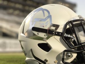
5. White with chrome gold decal: 2017
It looks like this is becoming the default helmet for UCF, and that is a very good thing. It’s probably one of the best white helmets in all of college football. The chrome gold against the matte white looks truly fantastic, especially during day games, where the sunshine glitters off the gold. I’m looking forward to seeing these helmets again in 2018.
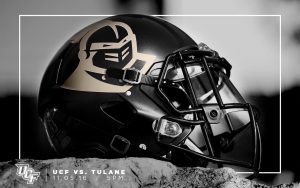
4. Black Ice: 2017
Who says UCF needs any gold to make an outstanding helmet? While this design strays quite a bit from the team’s identity, it’s still an amazing look. The way the chrome pops against the black is really spectacular, and it instantly became a fan favorite.
3. White reflective: 2016
The Knights wore this helmet twice in 2016 and, unfortunately, we haven’t seen it again since. Chrome Knightro must live on!
These helmets are great across the board and, more importantly, hold a special place in UCF design history. They were revealed a few days before the 2016 homecoming game against Temple, marking the first time UCF had a surprise uniform reveal.
Before this helmet, UCF fans had no idea what was to come in the many great surprise designs the team would roll out in the coming years.
2. Black with chrome gold decal: 2016
It’s like someone at UCF heard every single one of my issues with the team’s black helmets, and fixed them all to create a perfect design. This look may not exactly be one-of-a-kind, but that doesn’t change how great it is. This was our first look at the Knights in chrome gold, and there’s a reason the team relied heavy on reflective decals the next year.
The UCF logo simply looks spectacular in that shiny material, and the contrast against the black helmet makes for an awesome look. I’m hoping we get to see these helmets in 2018 after being absent last year.
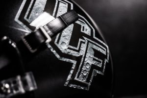
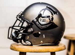
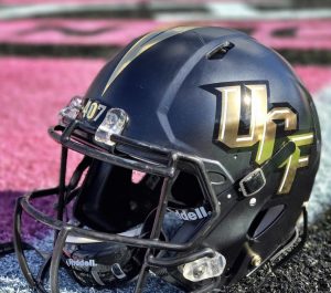
1. Space Helmet: 2017
What can you even say about these amazing helmets? Everything about them is perfect. The black base. The moon crater UCF logo. The astonishing constellation decal. The little stars placed at random points, mimicking the night sky, but on a helmet.
How could you ever top that?
I firmly believe these are not just the best helmets in UCF’s history, but the most creative design in all of college football history. And no other school could have pulled it off. The Knights’ ties to the space program made this look not just amazing, but meaningful. The team has already teased another “space game” in 2018 and I’m sure many fans cannot wait to see how UCF tries to top itself this year.
Disagree with my rankings? I don’t really care because I’m right and you’re wrong. But if you feel that strongly about it, you can tweet your frustrations at me at @ByCASimmons.